The breakdown/Rational:
Firstly I copy/pasted posts into Microsoft Word to use the word count tool. Once I found out how many words each post contained I categorised them in the following Pt brackets (Pts being Font size used in Photoshop). I figured this would be an easy way to show the viewer a representation of a large post. As the larger the post the larger its representation on the page.
1- 49 words 10pt
50- 99 words 20pt
100- 199 words 30pt
200- 299 words 35pt
300- 399 words 40pt
400- 499 words 45
500- 599 words 50pt
600- 799 words 55pt
800- 899 words 60pt
900- 999 words 65pt
1000+ words 70pt
Once I had the size font that each Post was going to be represented by I went about finding out how many links each post had. Once that was determined I gave them different colour values starting at black and as the number of links increased i went through the red scale from 1-10 links then blues scale 11-22 and then the green scale 23-34+. I used different colours as they have visual impact and allow the viewer to quickly see differentiate one post from another depending on its link tally.
Links in post
0 =Black
1 =50
Red scale value
2-3 =100
4-5 =150
6-7 =200
8-10 =250
11-13 =100
Blue scale value
14-16 =150
17-19 =200
20- 22 =250
23- 25 =100
Green scale value
26-28 =150
29-31 =200
32-34= =250
In my first attempt I also had a visual representation of how many pictures and videos each post contained. However on my final attempt I discovered Client Side Image Mapping. I used a free website that allowed me to do this
http://www.image-maps.com. Client Side Image Mapping is enables point and click interaction with image components on a web page.
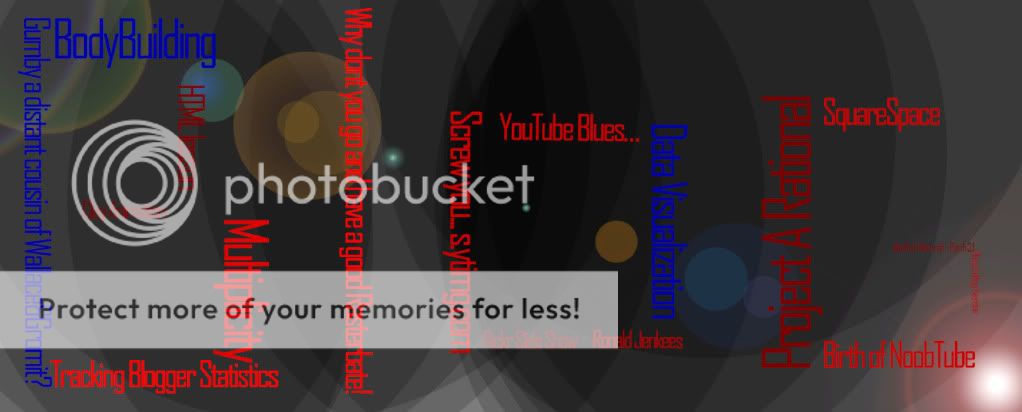
Underneath the main data visual I placed a small colour scale so that people can quickly reference how the amount of links in a post determines the colour of the post title on the page.
I uploaded my visualisation on
http://www.photobucket.com and then went about mapping it. Now when people look at my visual representation, they can click on the different post names and get directed to that specific post. There is also a hover that will tell them the breakdown of the post in word count, video clip count, link count and picture count.
I originally wanted some way of retrieving the blog data using yahoo pipes, so that I could enter in numerous blogs and have data representations automatically generated from the data accumulated. I thought it would be a fun way to compare classmate’s blogs. However with my limited computing skills this wasn’t viable in the time frame.. I’m happy with what I achieved and learnt heaps along the way! The background image was also created on Photoshop using i large diamator black brush with low pressure and using a flash flare filter.
This method of visually representing a blog, allows the viewer to quickly determine short posts from long posts. Determine how many links a post has and on closer inspection using mouse hover, how many pictures and videos the post has. If this was programmed to generate automatically through a data feed it could be a widget on blog side bars. This would allow people looking at a blog for the first time to quickly identify posts they might find interesting.
The closest data visualisations by other people that are similar to mine are word clouds or tag clouds. These however usually represent how often a single word is repeated on a web page. Allowing people to quickly get an idea of what the page is about.
First attempt, method and idea explained underneath

Visual representation of Blog data
- From first to last post, 1 representing the first post, 2 the second ect....
- The larger the numeric representation the more words within that post. Each word in the post is represented by an extra pt in text size
- The colour of the number represents the number of links, pictures and videos in the post its representing.
- Using the RGB colour scale I multiplied the value of links,picture and videos by the following amounts:
Video results x100 on the Red value.
Links result x10 on the Green value.
Picture results x50 result on the Blue value.
The maximum being 255 on any of the scales, so if the number exceeded 255 it was just represented at the max value (255)
The reason they were multiplied by different amounts was to show a larger colour difference than would have otherwise been achieved if each were multiplied by the same amount
Here is the RGB data for the Colouring of the numbers:
| Post number | Red value | Green value | Blue value |
| 1 |
| 0 |
| 40 |
| 0 |
|
| 2 |
| 0 |
| 20 |
| 50 |
|
| 3 |
| 0 |
| 10 |
| 0 |
|
| 4 |
| 100 |
| 30 |
| 0 |
|
| 5 |
| 0 |
| 10 |
| 0 |
|
| 6 |
| 100 |
| 10 |
| 0 |
|
| 7 |
| 0 |
| 40 |
| 50 |
|
| 8 |
| 0 |
| 10 |
| 0 |
|
| 9 |
| 100 |
| 10 |
| 0 |
|
| 10 |
| 100 |
| 110 |
| 0 |
|
| 11 |
| 0 |
| 50 |
| 0 |
|
| 12 |
| 0 |
| 50 |
| 0 |
|
| 13 |
| 0 |
| 60 |
| 0 |
|
| 14 |
| 100 |
| 110 |
| 0 |
|
| 15 |
| 100 |
| 110 |
| 50 |
|
| 16 |
| 100 |
| 90 |
| 50 |
|
| 17 |
| 0 |
| 90 |
| 0 |
|